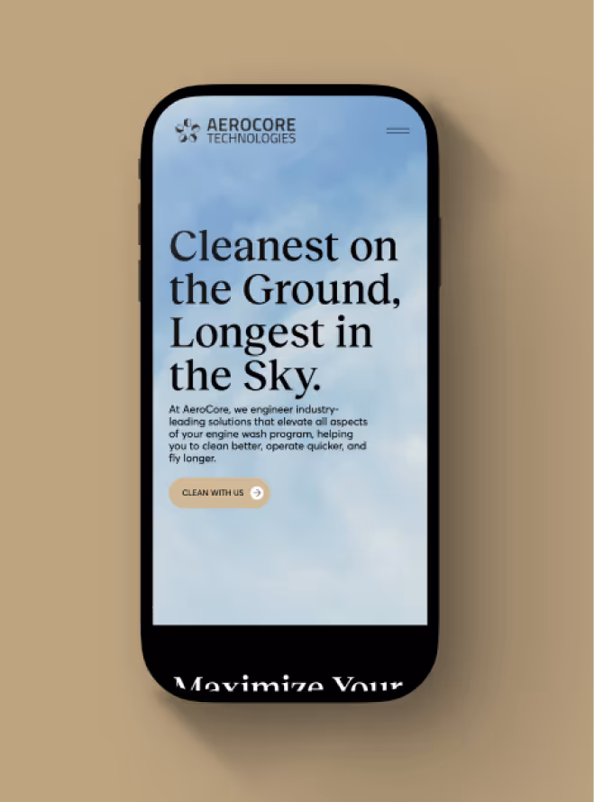
Tensure
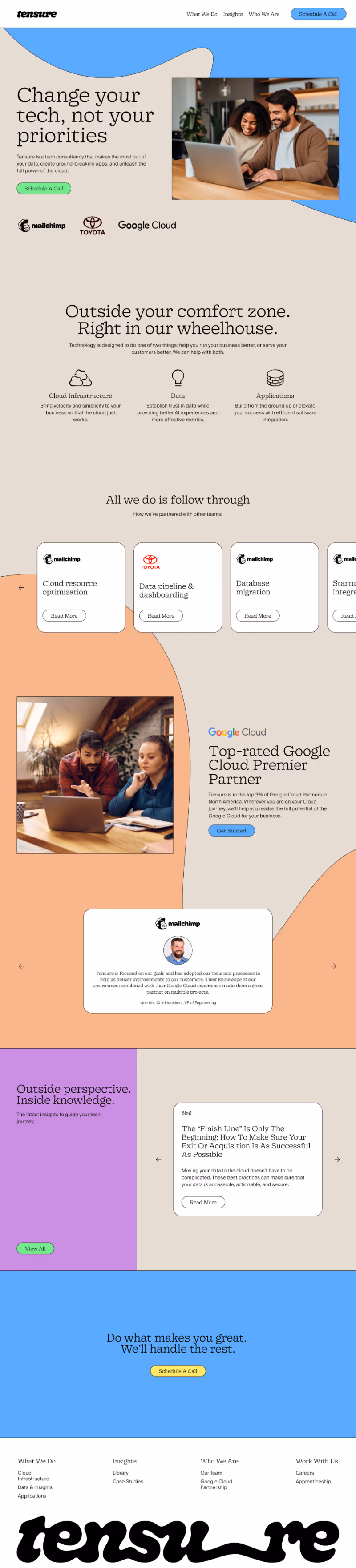
Change your tech, not your priorities

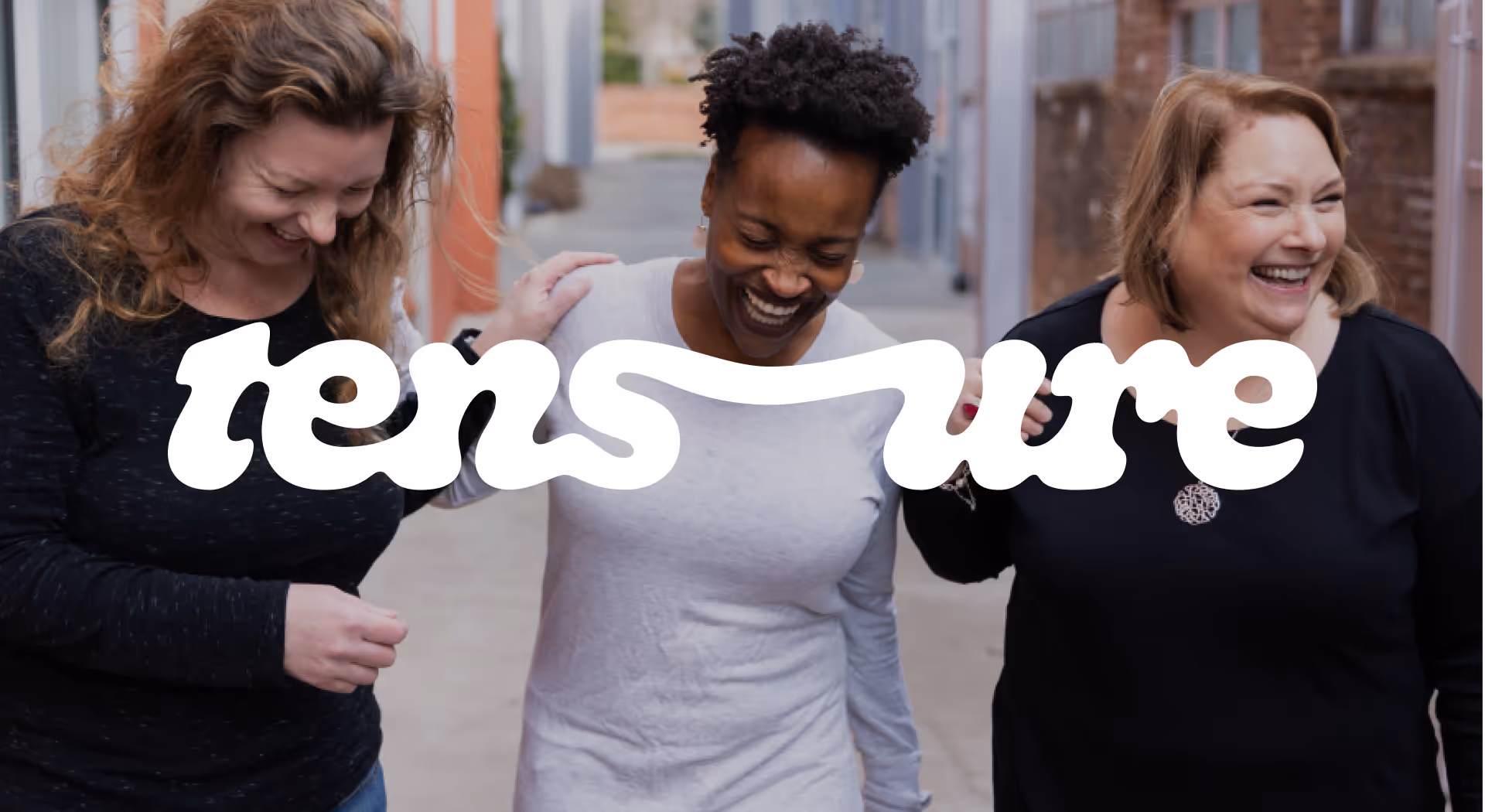
Stretching the Brand (And the Boundaries)
Tensure is a tech consultancy that helps businesses scale through automation, data, and cloud solutions. Their rebrand—developed by Matchstic—pushed the edges of tech identity: expressive goop graphics, conversational copy, and a visual system that traded polish for personality.
The goal was to turn this rich brand into a functional, scalable website. Tensure didn’t need a typical SaaS site—they needed something playful but smart, dynamic but structured. And most of all, they needed a system that could grow without losing the tone they worked so hard to define.
Key Objectives
- Bring a bold, expressive brand system into a fully functional web experience
- Balance playful design with visual clarity, hierarchy, and scannable content
- Build scalable CMS architecture for content flexibility
- Drive conversions through a consistent, interactive CTA connected to CRM
Designed to Flow
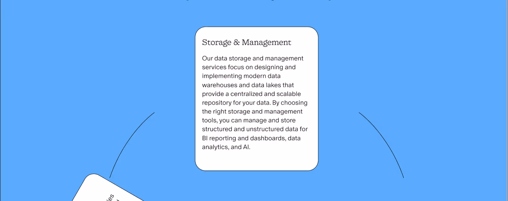
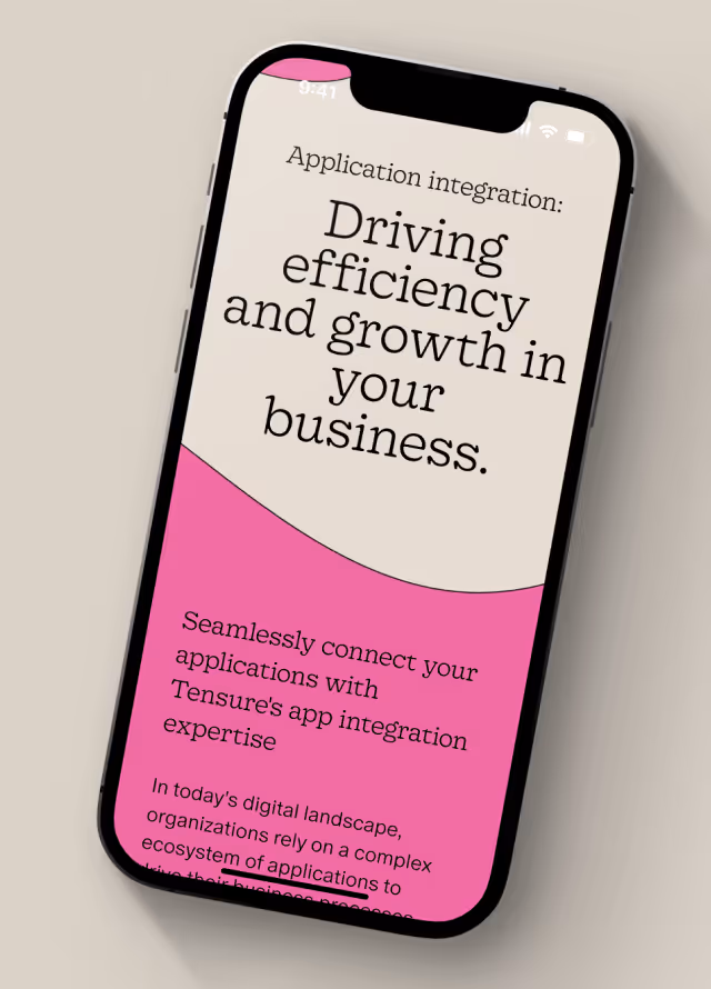
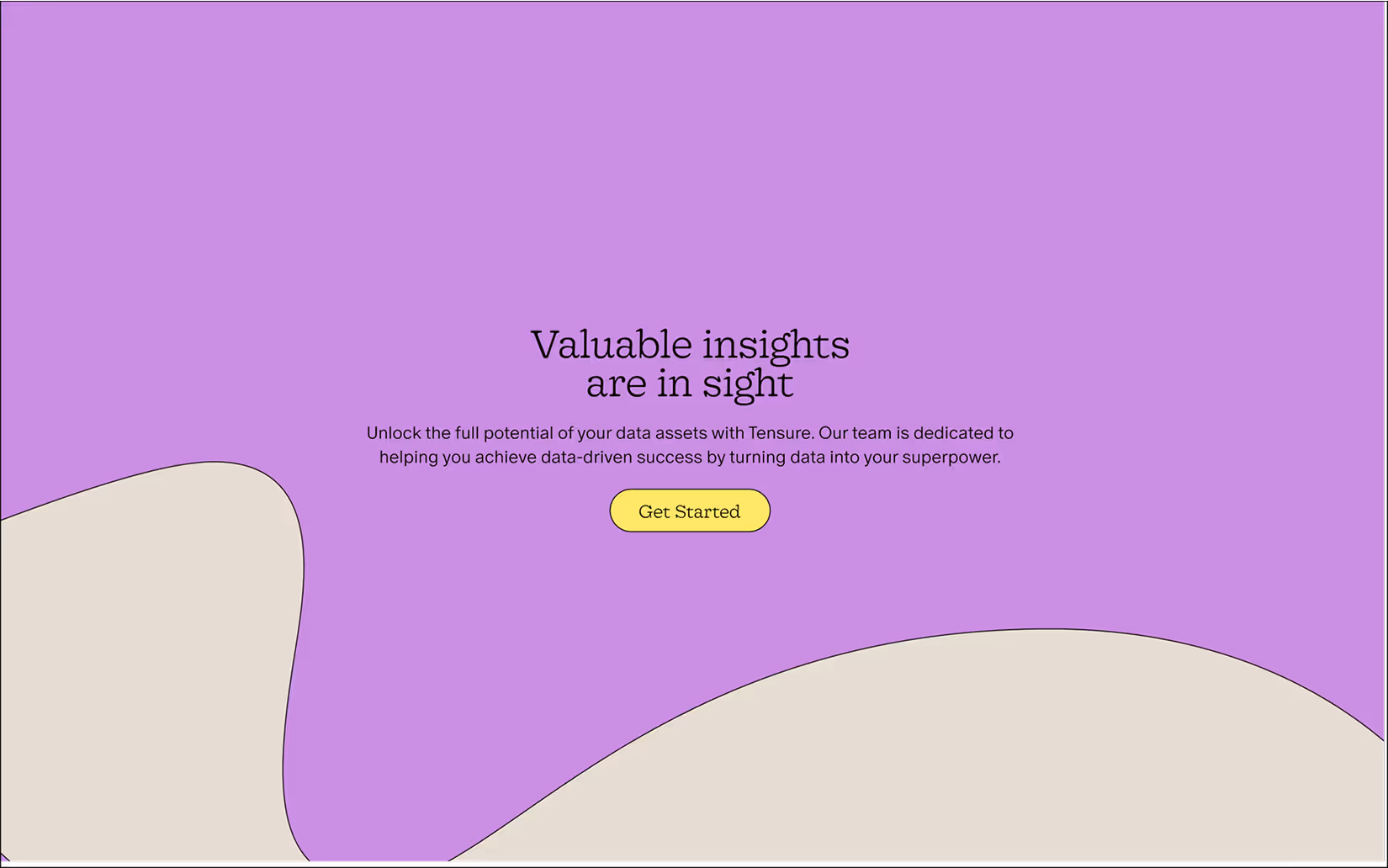
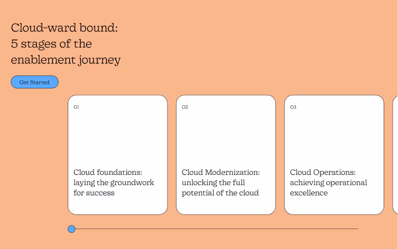
Content structure leaned hard into simplicity. Every page prioritized visual hierarchy and scannable text—on purpose. In a space filled with dense, technical language, this site makes a different kind of bet: that clear messaging, well-paced layouts, and short bursts of information can do more than a wall of copy ever could. It's a choice that’s still being protected long after launch.
While the site avoids over-animation, select forced-scroll moments on internal pages help maintain flow and direct attention through heavier content. Button interactions and carousel motion add just enough feedback to keep things feeling tactile—but the focus stays where it should: on making complexity feel easy to move through.

Built to Stay Weird and Stand Out (In a Good Way)
This project quickly became a case study in what it takes to protect a strong brand in motion. Tensure’s rebrand was bold, expressive, and remarkably clear—but translating that into a living system required intention at every level. From visual hierarchy to CMS setup, every decision was made to balance growth with brand integrity. The real challenge wasn’t the design—it was (and still remains) holding the line on content clarity and simplicity in a space that loves to over-explain.
The final site reflects the best of what Tensure stands for: confident, smart, and never boring. It’s a flexible system that scales, but stays rooted in the brand’s tone and visual rhythm. In a category full of generic templates, it carves out something memorable—and proves that expressive doesn’t mean messy, and structured doesn’t have to be dull.
Websites that reflect the brands behind them.


A few examples of what intention looks like online.
Redesign, refresh, or retainer—each engagement balances the strategy that supports scale with the details that define brand identity.
