Brightwild
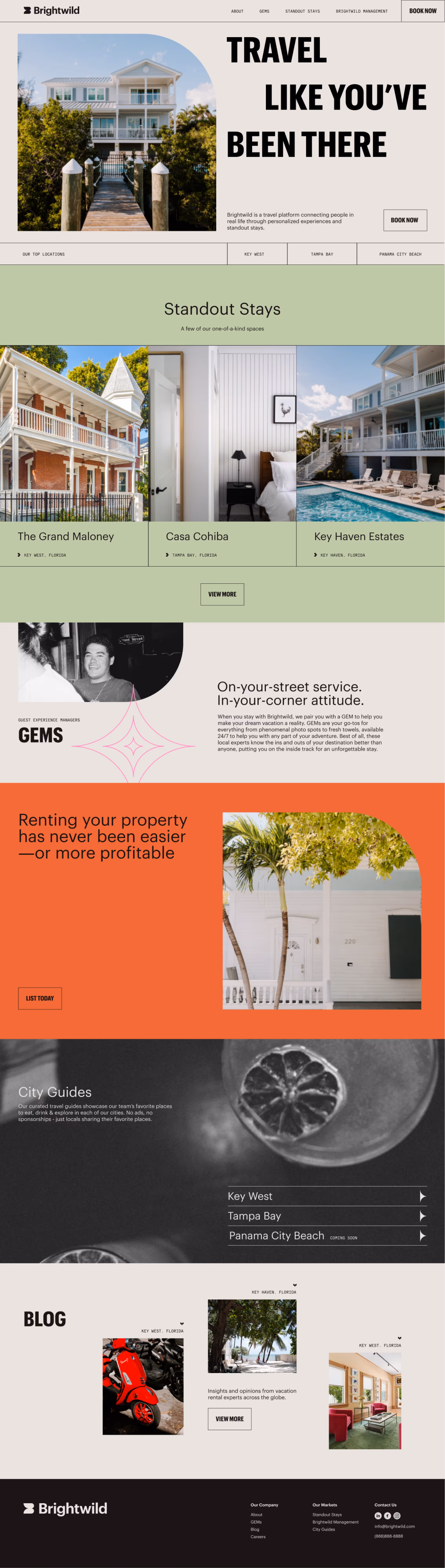
Travel Like You've Been There Before
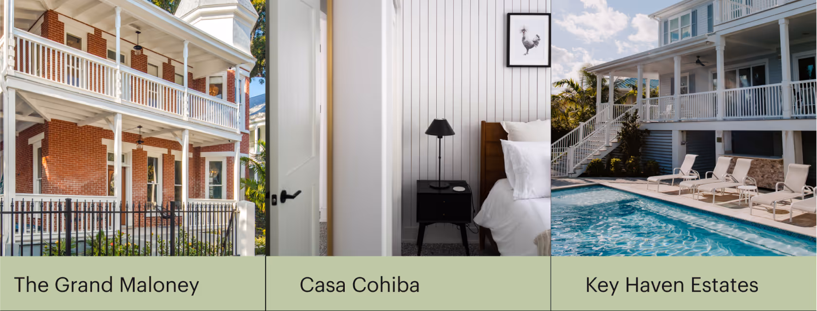
From Property to Platform
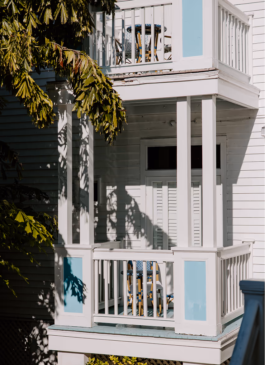
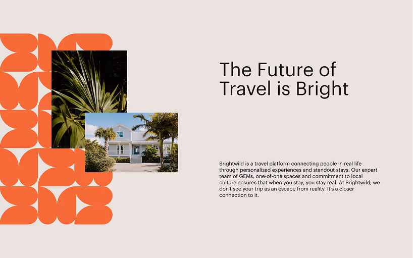
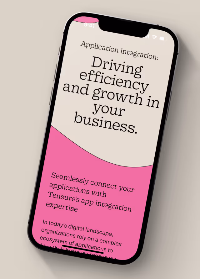
Brightwild is reimagining what a travel platform can be—transforming vacation rental stays into immersive, concierge-supported experiences. Their rebrand, crafted by the Matchstic team, marked a bold departure from industry norms: vibrant color, expressive type, and a dynamic brand system built to feel high-end but never off-limits.
The challenge was translating that new identity into a digital space that could grow alongside the brand. Originally scoped as a small web engagement, the work quickly evolved into a full digital platform—serving as the current evolving site experience for the Brightwild brand.
Key Objectives
- Translate an expressive brand into a meaningful digital interface
- Balance playfulness with premium through layout, movement, and type
- Develop editorial-inspired structures for higher-touch content
- Build out CMS systems in Webflow to support multiple content updating needs

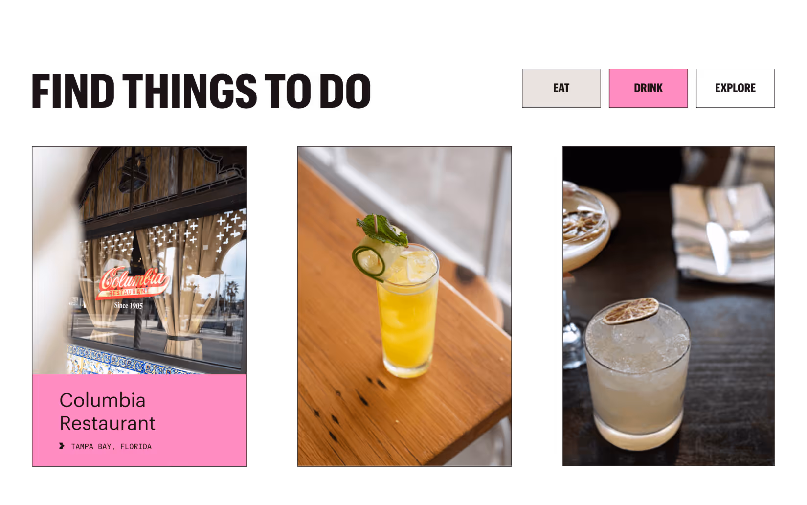
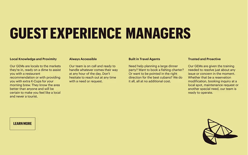
Design with a Pulse
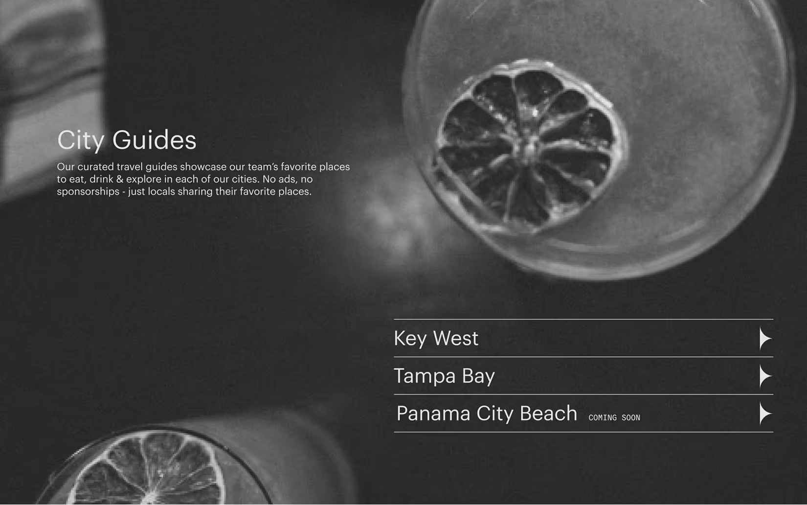
Editorial layouts helped pace more content-heavy pages, giving structure without losing connection to the visual identity. Text placement was especially nuanced—oversized type needed to flex responsively, wrap cleanly, and maintain flow across breakpoints. Graphic elements like arrows and branded shapes added movement and reinforced brand language, even in static moments.
Behind the scenes, the build became a crash course in Webflow. From learning how to structure animations to working around text wrapping issues and responsive spacing for oversized type, every block was considered. The final site doesn’t just echo the brand—it expands on it. It’s bright, a little wild, and always in motion—exactly what the brand set out to be.
More Than a Site, A Partnership
This project became a lesson in partnership. Multiple creative stakeholders, shifting priorities, and iterative rounds revealed the importance of maintaining boundaries and scope—even when collaboration is going well. It was an experience in building with agility, staying adaptable, and keeping the structure grounded even when the brand flies high.
Brightwild’s digital presence now mirrors the energy of their real-world stays (and the partnership they provide through their unique product offering): polished, playful, and intentionally off-script. From oversized headlines to branded button arrows, every detail adds up to a first impression that feels fresh and unforgettable. It’s not just a booking platform. It’s a new standard for what experience-driven hospitality can look like online.
Websites that reflect the brands behind them.


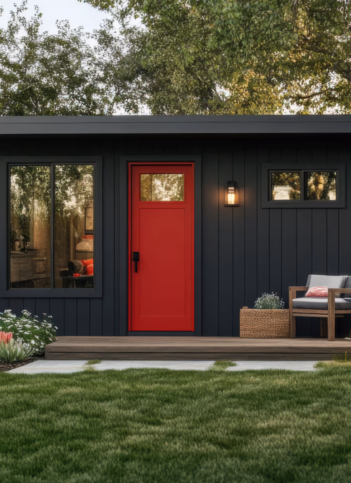


A few examples of what intention looks like online.
Redesign, refresh, or retainer—each engagement balances the strategy that supports scale with the details that define brand identity.
